PROJECT OBJECTIVE
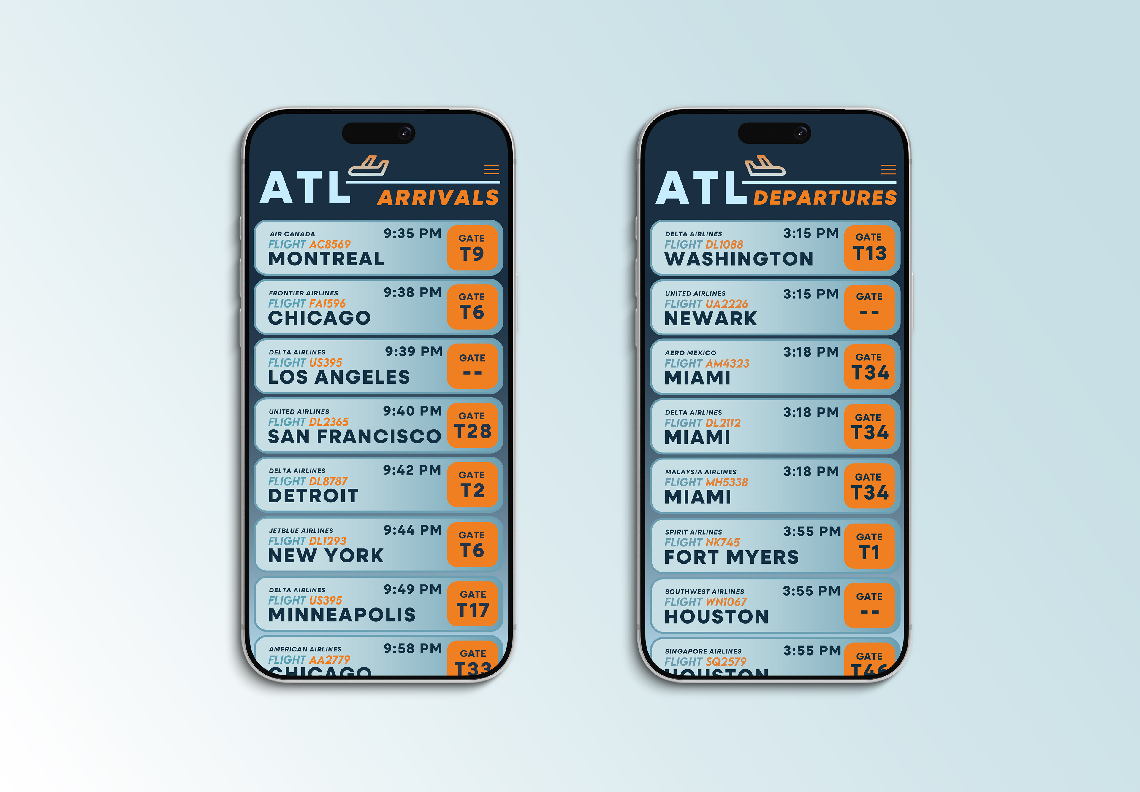
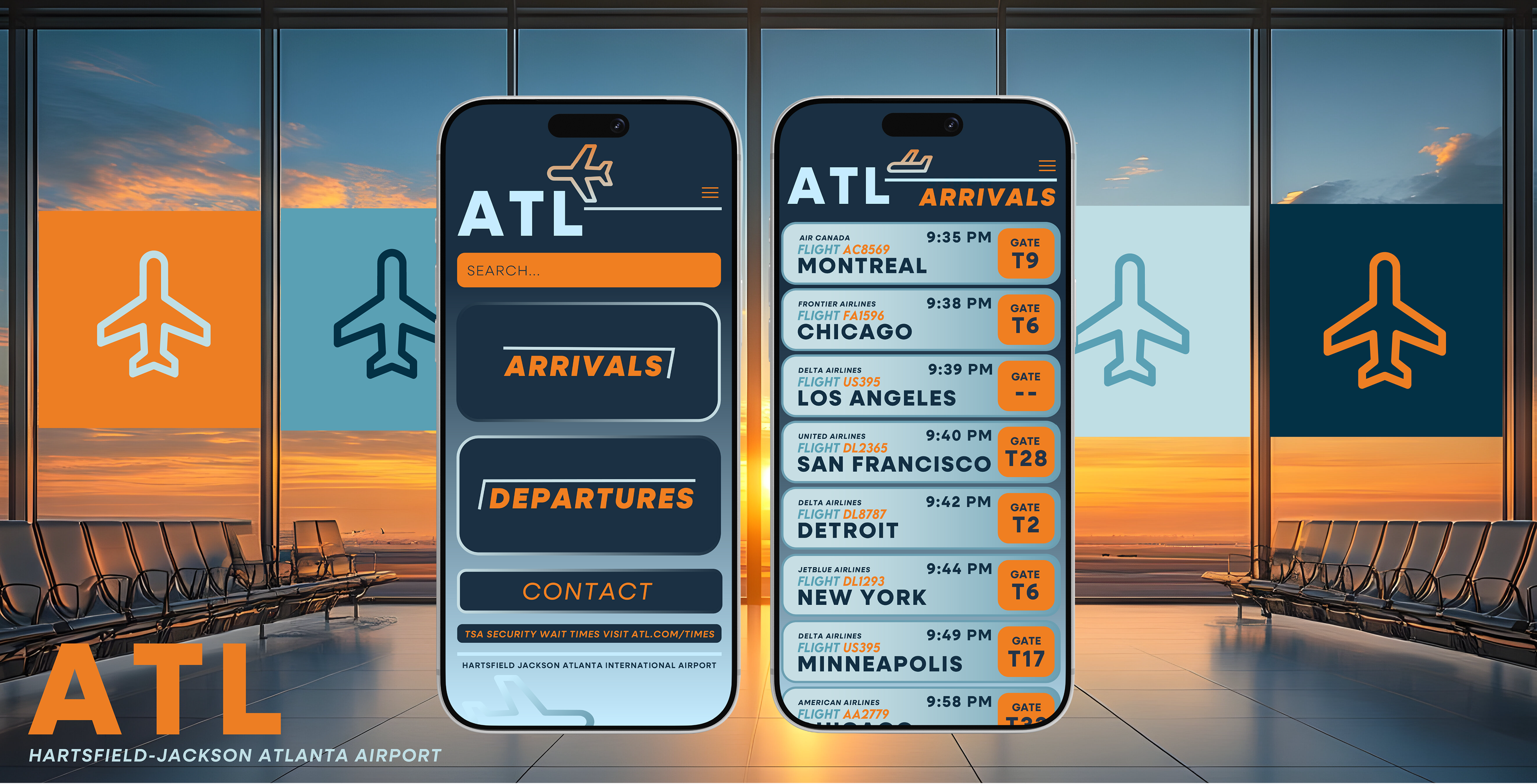
Create a flight information display system that utilizes typographic hierarchy to facilitate accessibility and readability for users.

INITIAL BRAINSTORM
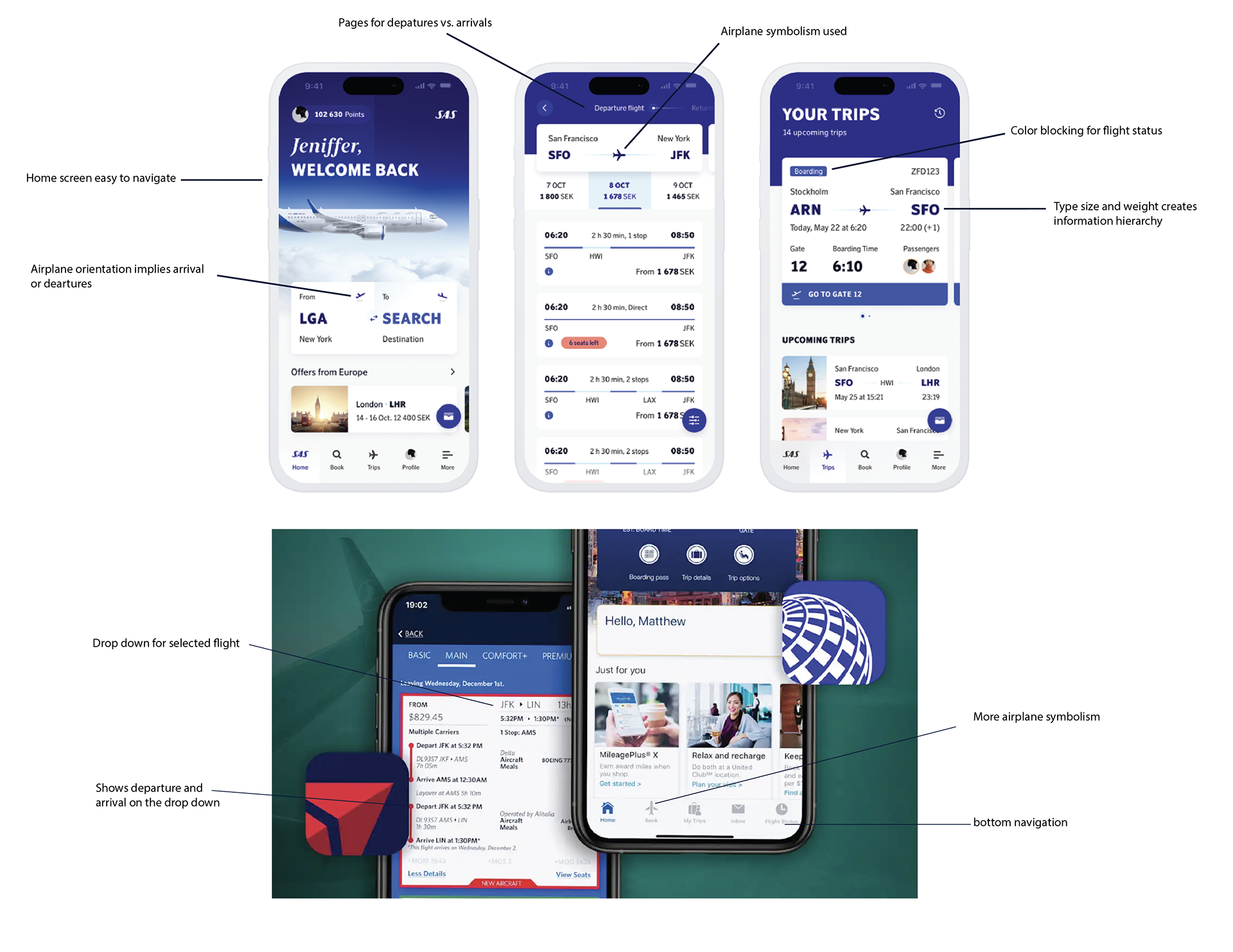
Started my process by analyzing existing airline apps. I noted successful design choices. By analyzing these existing apps allowed me to brainstorm concepts I wanted to bring into my own design.
PROCESS WORK

TYPOGRAPHY
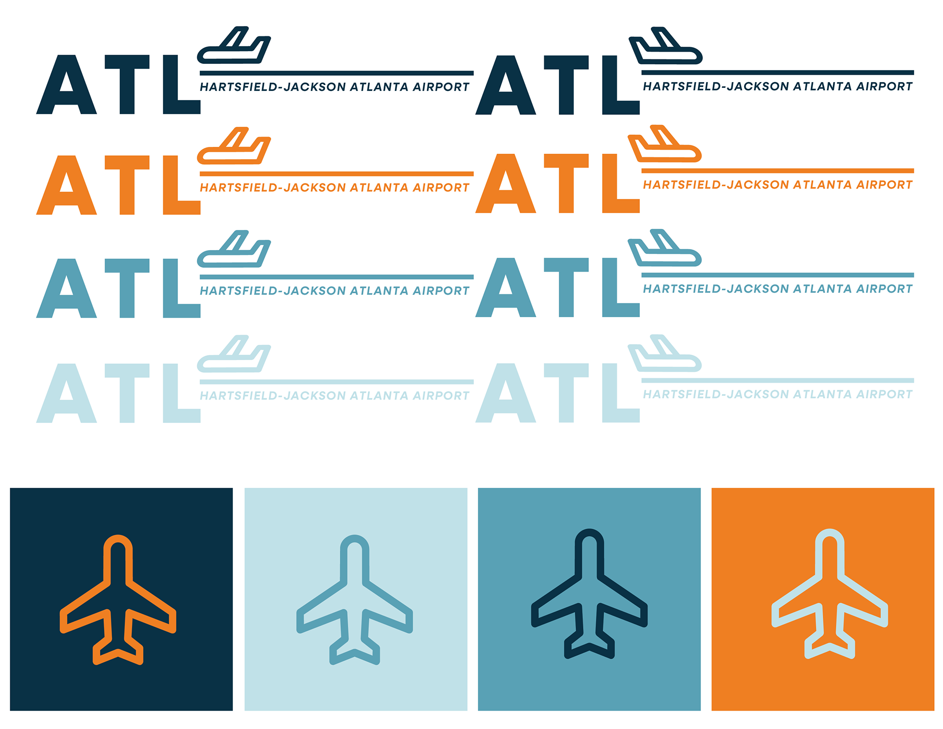
Neulis Sans was chosen as the font because of its legibility and variety of typefaces. The diversity of weights allows for hierarchy between information, creating easy navigation.
COLOR PALLETE
A complementary color palette was chosen to give viewers a sense of ease while also communicating hierarchy. The high saturation orange creates a sense of importance and urgency. While the calm blues represent less important information.
ONE CELL IDEATION
I created iterations of one cell component of the flight page. Explored information hierarchy and placement. While also pulling ideas from my inspiration, I was able to determine what elements I was drawn to that worked with my cell design.
FULL SYSTEM ITERATIONS
I chose my best two cells and created an entire page of flight information. While also exploring placement, color hierarchy, and text hierarchy.


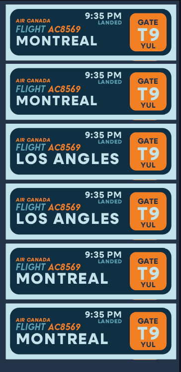

FINAL